People ask us all the time: why roses? Of all the designs you could put on a mug or a blanket, why always roses?
The answer is personal. And it shapes everything we create.
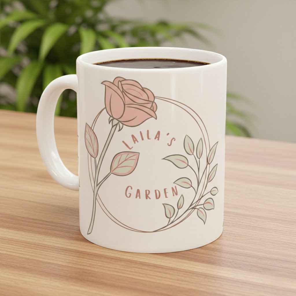
Why Roses
Roses survive the harshest winters. They look dead — just thorns and bare branches — for months. But underneath, they're alive. Waiting. And when conditions are right, they don't just come back. They bloom with a beauty that makes you forget the winter ever happened.
That's Laila's story. That's our story. And we believe it's the story of every person going through cancer treatment. You are not dying. You are dormant. And your spring is coming.
So roses aren't just a design choice. They're a philosophy. Every time you look at a Laila's Garden product, you're looking at a promise: this winter will end, and you will bloom again.
The Comfort Filter
Before any design makes it into our shop, it has to pass what we call the "Comfort Filter." It's three simple questions:
1. Would this bring comfort to someone sitting in a chemo chair?
2. Is the message hopeful without being dismissive of pain?
3. Would Laila want to receive this as a gift?
If the answer to any of these is "no," the design doesn't make the cut. It sounds simple, but this filter eliminates a lot of what you see in the typical cancer awareness market. "You'll beat this!" fails question two — it's dismissive of the real possibility that treatment is hard and uncertain. Pink ribbons on everything fail question one — they don't bring comfort, they bring reminders. Generic motivational posters fail question three — Laila wouldn't want them.
Our Color Choices
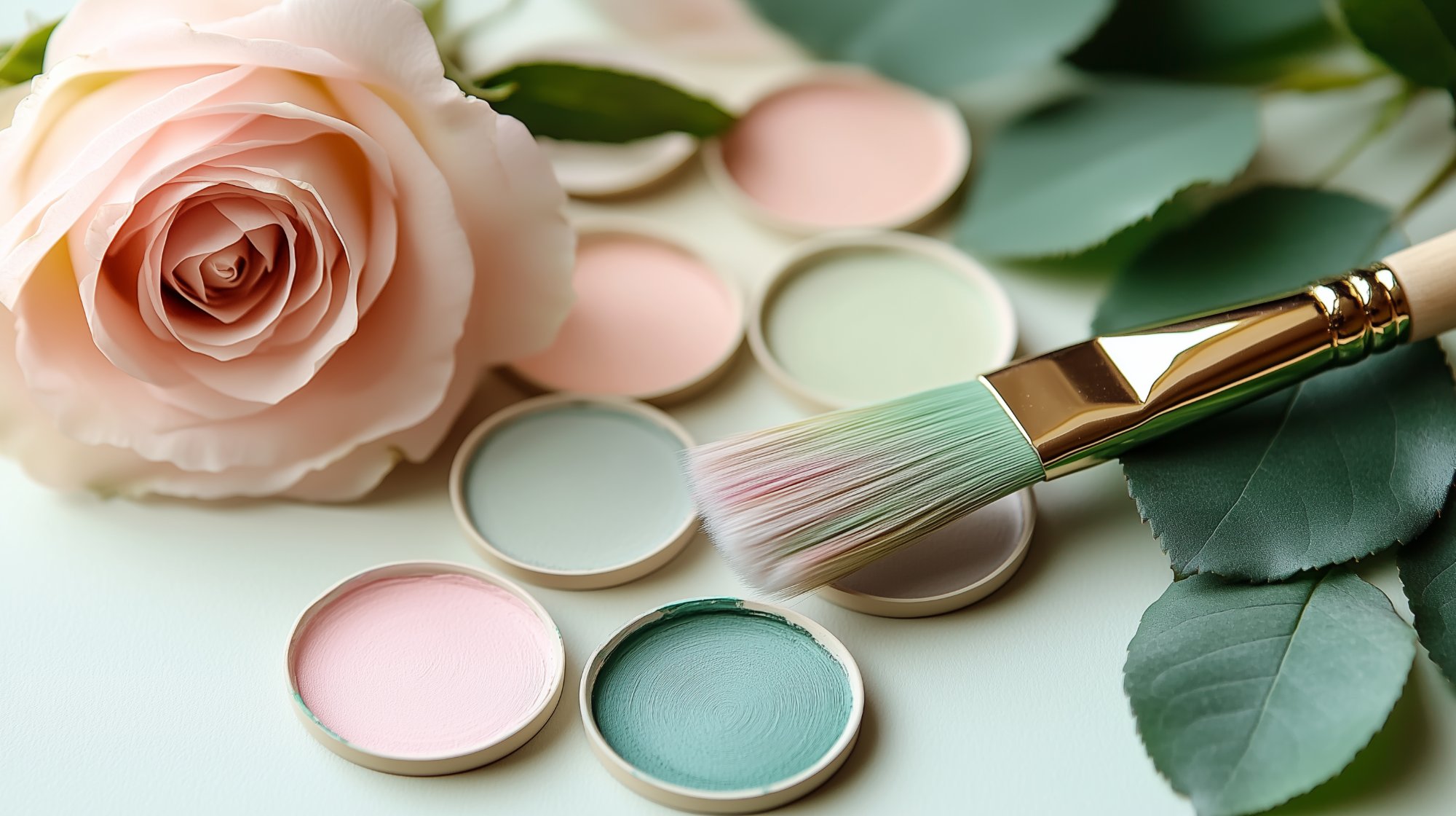
Colors carry emotional weight. We chose every color in our palette with intention.
Blush Pink (#F8C8DC) is our primary color. Not hot pink. Not neon. Soft, warm blush — the color of the inside of a rose petal just before it opens. It feels calm without being clinical. Feminine without being aggressive. It whispers "hope" instead of shouting "awareness."
Sage Green (#9CAF88) connects everything back to the garden. Green is growth. It's life continuing. It's leaves supporting the blooms. Every time sage green appears in our designs, it's saying: you are still growing.
Cream (#FFF5E1) is our background. Not stark white, which feels cold and hospital-like. Cream feels like warm light through a window. It feels like a cup of tea. It feels like home.
Gold (#D4AF37) is reserved for celebration. End of treatment. Survivor anniversaries. Milestones. Gold says: you made it through. You are precious. This moment deserves to shine.
Words We Choose (and Words We Don't)
Language matters enormously in the cancer space, and most brands get it wrong. We spent a lot of time talking to survivors, reading cancer support forums, and most importantly, living through it with Laila.
Here's what we learned: battle language hurts. "Fight cancer." "Cancer warrior." "Beat this." "Win the battle." These phrases might seem empowering, but they carry a dark implication: if you don't survive, you didn't fight hard enough. That's a terrible burden to place on someone.
Instead, we use growth language. "Bloom." "Grow." "Flourish." "Hope." "Love." "Comfort." These words don't create winners and losers. They create space for whatever the journey looks like. You can bloom during treatment. You can grow through pain. There's no failure in these words.
Why Watercolors
We chose a watercolor style for our artwork deliberately. Watercolors are gentle. They have soft edges that bleed into each other. They're imperfect in a beautiful way — no two strokes are exactly alike.
That felt right for what we're doing. Cancer treatment isn't clean lines and perfect geometry. It's messy. It's unpredictable. The beauty in watercolors is that the imperfection IS the beauty. The way colors blend unexpectedly. The way edges blur softly instead of cutting sharply. It mirrors the way hope shows up during treatment — not as a sharp, defined thing, but as a gentle wash of color that gradually fills the space.
What's Coming Next
We're expanding the garden. New products are in development that we're incredibly excited about.
Personalized family blankets — because the most meaningful gift survivors told us about was blankets with their family names. Something that keeps you warm while reminding you of the love waiting at home.
Garden tote bags — practical, beautiful, covered in our rose pattern. For hospital visits, daily errands, or just carrying hope with you wherever you go.
Palestinian Heritage Collection — this is deeply personal. Shaheen and Laila are from Gaza, and they're developing a collection that combines roses with traditional tatreez embroidery patterns. It's a fusion of their two stories: the garden of hope and the cultural heritage they carry with them.
Every new product goes through the same Comfort Filter. Every color stays within our palette. Every message passes the test: would Laila want to receive this?
Because at the end of the day, we're not designing for a market. We're designing for a person. For the woman sitting in a cold chemo chair, wrapped in a blanket, holding a warm mug, looking at a piece of art on the wall that says something gentle. Something hopeful. Something true.
We're designing for Laila. And for everyone whose story looks like hers.
With love, Shaheen 🌹